Quote:
Originally Posted by Fish

It doesn't necessarily matter which exact months it covers. The vaccines have proven to be an incredible success across the board, and it's pretty silly to deny it at this point.
|
Wow. And you try to put off like you're the smart one in the room? It doesn't matter which months you look at? Really? So if you include the data from when the vaccine wasn't readily available and most people weren't vaccinated you don't think it skews the numbers? Have you looked at deaths of vaccinated vs unvaccinated for recent months? Of course you haven't because you wouldn't be saying that if you did.
I shared this in the other post. I'll share it again here.
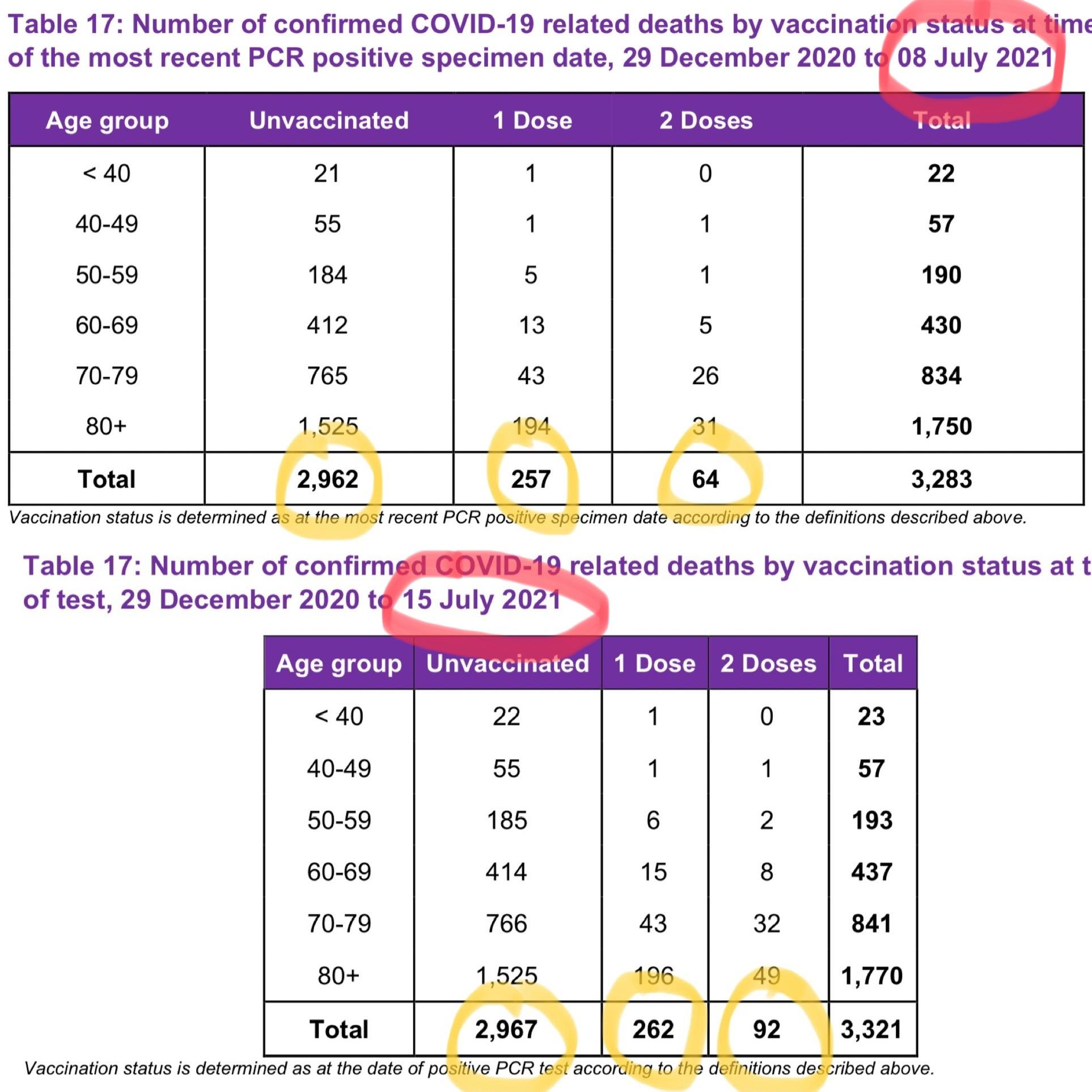
When you look at just one of the charts in the picture above, I understand why you would think most deaths are in the unvaccinated. Clearly there are more vaccinated deaths according to just one of those charts by itself. Now look at the dates. They are measuring back to December when most weren't vaccinated. However, if you compare the charts from one week to the next you can see what the newest data is. You'll see that CURRENTLY just as many vaccinated are dying as non-vaccinated. The numbers don't lie. Just the people that report them. The graphic like the one I originally commented on bothers me because vox made an intentional decision to not show what months they were including. If they did the same graphic, but only using data from last month it wouldn't look anything like the graphic they published.